hey, now we're seniors
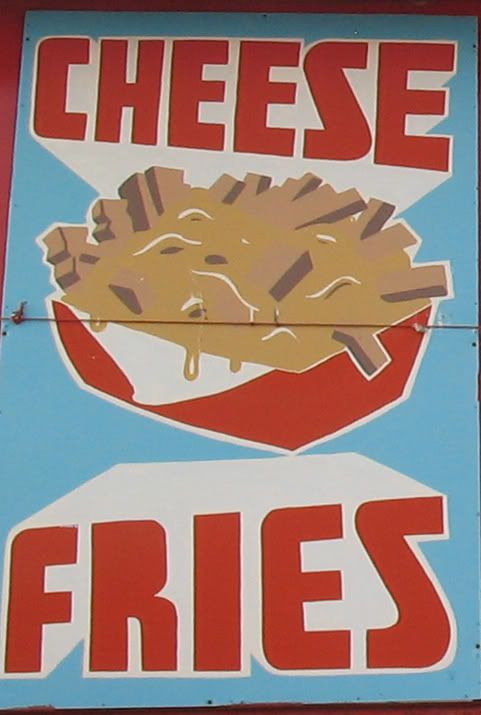
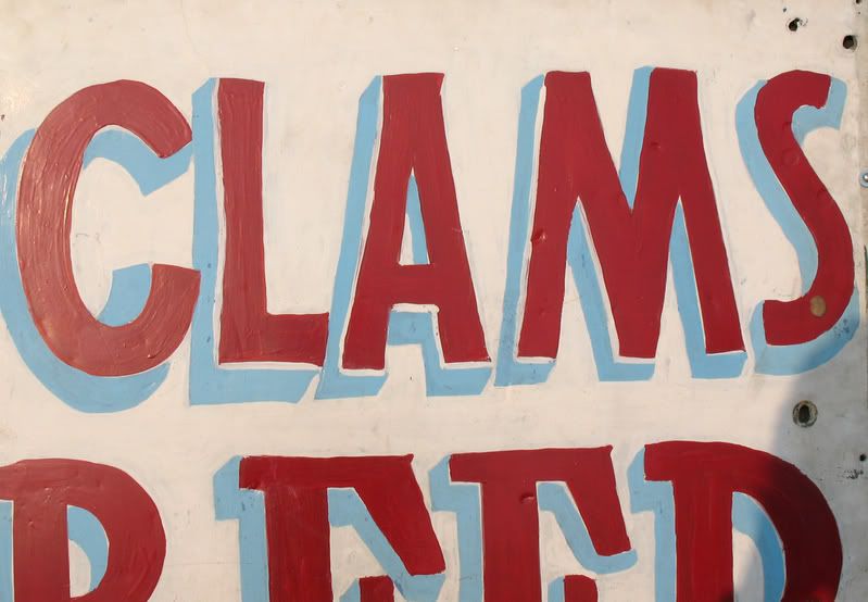
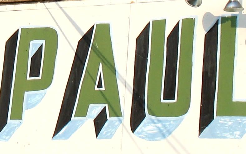
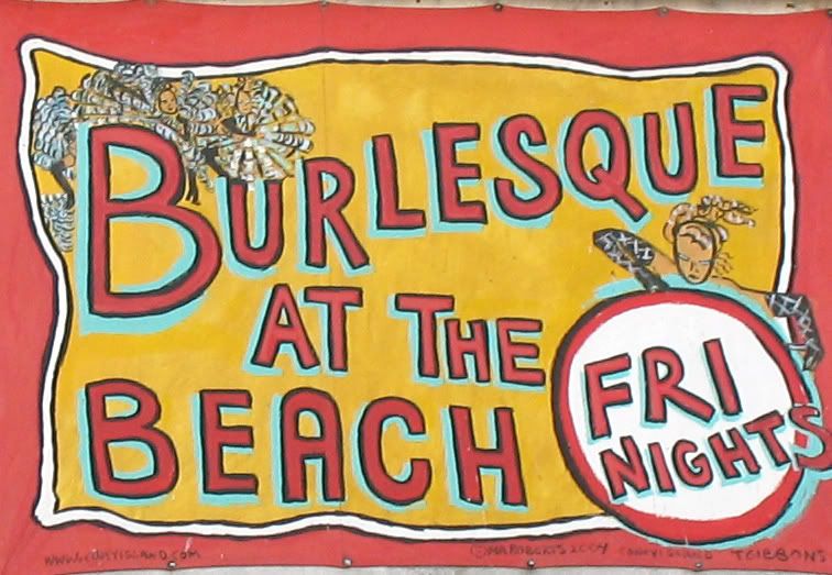
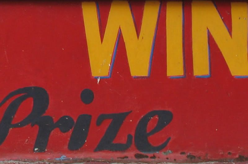
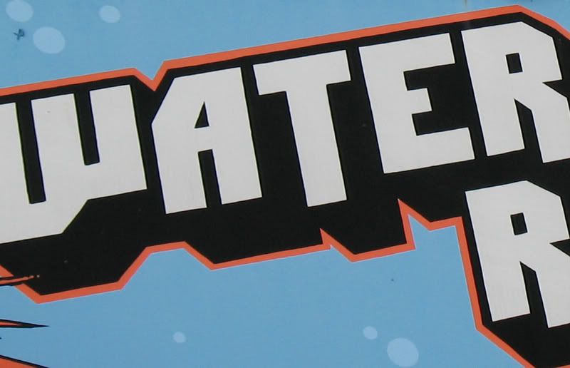
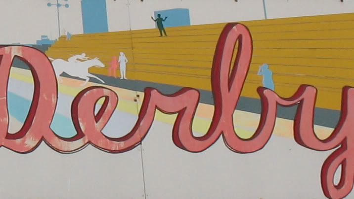
awesome - my only criticism is that maybe you didn't understand the assignment. Only ONE letter in each photograph. You've got a lot of work to do.
i reckon you could crop the pictures a bit... you've got some nasty corners in there...;)seriously though, that place looks like a gold mine.i'm going to stop putting "- austin" at the end of my replies as i just noticed it already says "austin said..."
Post a Comment


2 comments:
awesome - my only criticism is that maybe you didn't understand the assignment. Only ONE letter in each photograph. You've got a lot of work to do.
i reckon you could crop the pictures a bit... you've got some nasty corners in there...
;)
seriously though, that place looks like a gold mine.
i'm going to stop putting "- austin" at the end of my replies as i just noticed it already says "austin said..."
Post a Comment